Building a Design System
🔍 PROJECT DETAILS
Client:
Figma Community
Task:
Review of general points to create a Design System from scratch
Target:
Consistency and Efficiency
🏔️ THE CHALLENGE
Coordinate the design of physical and digital experiences through flexible guidelines that promote systemic thinking and enhance design practices, with a special emphasis on the design and development teams.
How to maintain consistency, quality, and efficiency across all experiences?
This is a major challenge in terms of time and money when different teams are behind the products, channels, and both financial and non-financial services.
🎯 THE TARGET
The main objectives of the design system are essential for ensuring consistency, quality, and efficiency across all user experiences.
Structuring these steps facilitates team collaboration and optimizes the design process.

📦 WHAT SHOULD A DESIGN SYSTEM INCLUDE?
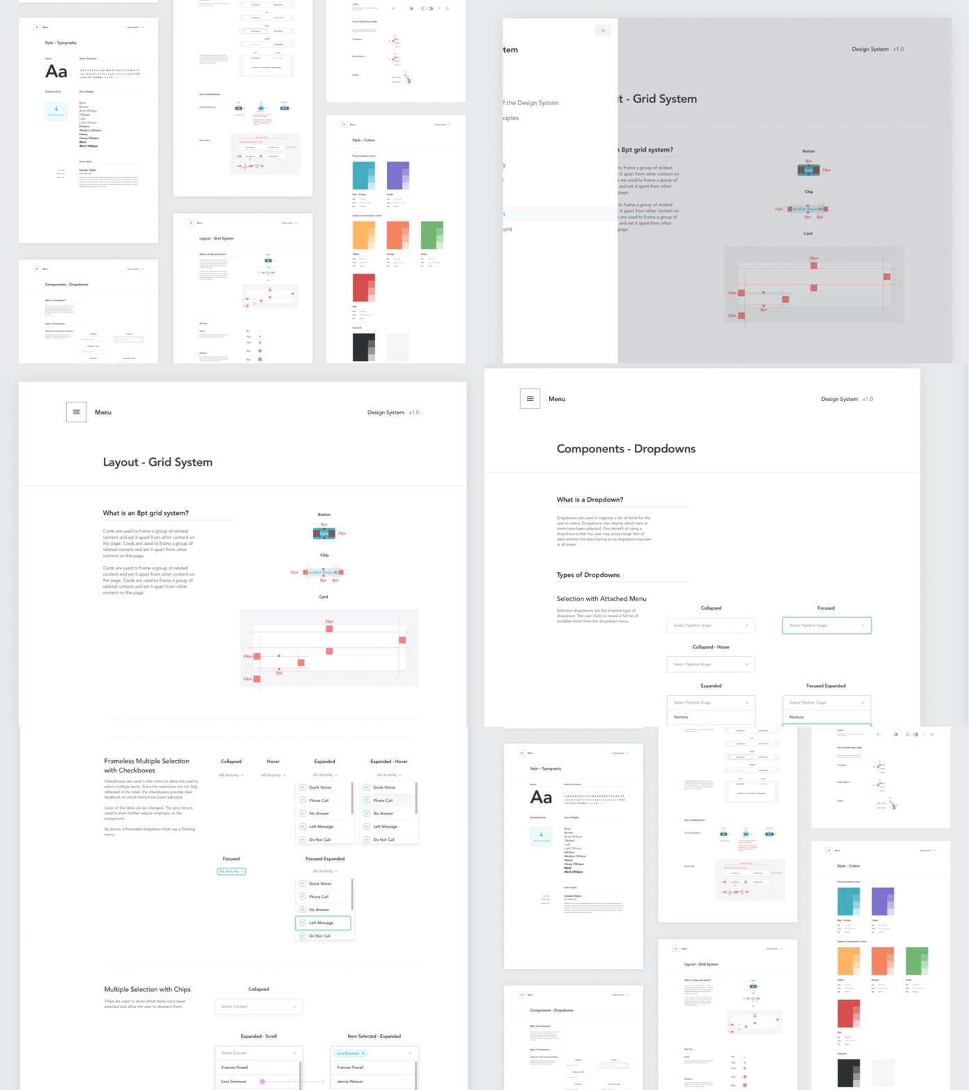
It’s important to realize that a design system goes beyond a style guide or pattern library created for a specific project. It should be a dynamic product that evolves alongside the organization and its digital platforms, serving as a reference for designers and developers.
A design system must have:
- Principles and guidelines: Foundational directives covering UX/UI standards, accessibility, animation, and scaling.
- Pattern library: Reusable components, color tokens, templates, and visual artifacts for design consistency.
- Code: Code snippets for components, including standards, versioning, and supported platforms.
- Documentation: Importance of having well-documented rules for consistency, clarity, and effective communication.
Define
🕵️ UI AUDIT
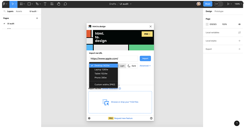
We conducted a visual audit of all experiences and evaluated the impact of a design system on our organization.
We consistently use the visual brand language and identity.
We are ready to create our first Fundations
🧱 FOUNDATIONS
We will follow the ⚛️ Atomic Design Methodology adapted to our times.
This approach breaks down design elements into fundamental building blocks, ensuring a systematic and scalable design process.
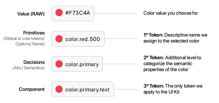
 Tokenization
As we expand the design system, we’ll collaborate with development on
Token names, setting initial guidelines that can evolve.
Proper naming ensures consistency and control, making it easier to manage and scale the design system effectively.
This method supports a cohesive design language across all platforms.
COLOUR![]()
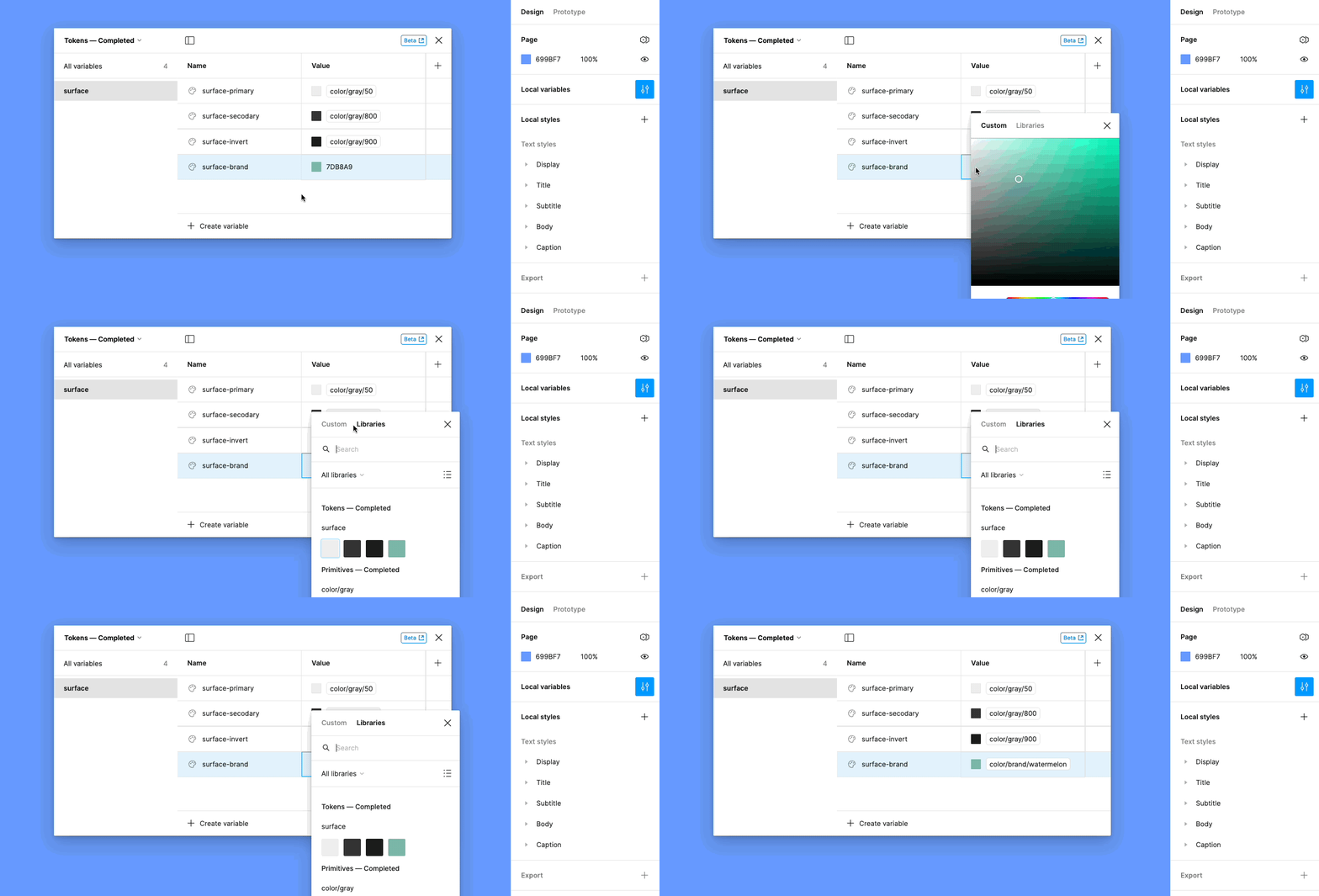
Defining and tokenizing colors ensures visual consistency across all platforms, simplifies global updates, and helps maintain brand identity.
This process makes it easier to manage and implement color schemes efficiently throughout the design system.
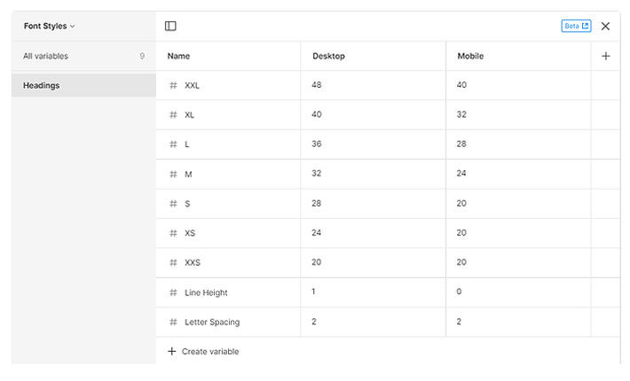
TYPOGRAPHY![]()
Tokenizing fonts ensures uniform typography, improving readability and user experience across different devices and screen sizes.
This approach allows for consistent text styling and easy updates, maintaining a cohesive visual identity throughout the design system.
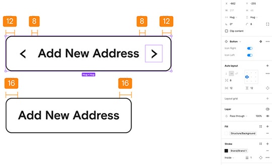
SPACING![]()
Spacing tokens maintain consistent proportions and alignments, enhancing visual harmony and structure in the design.
This standardization simplifies adjustments and ensures that spacing remains uniform, improving the overall layout and user experience.
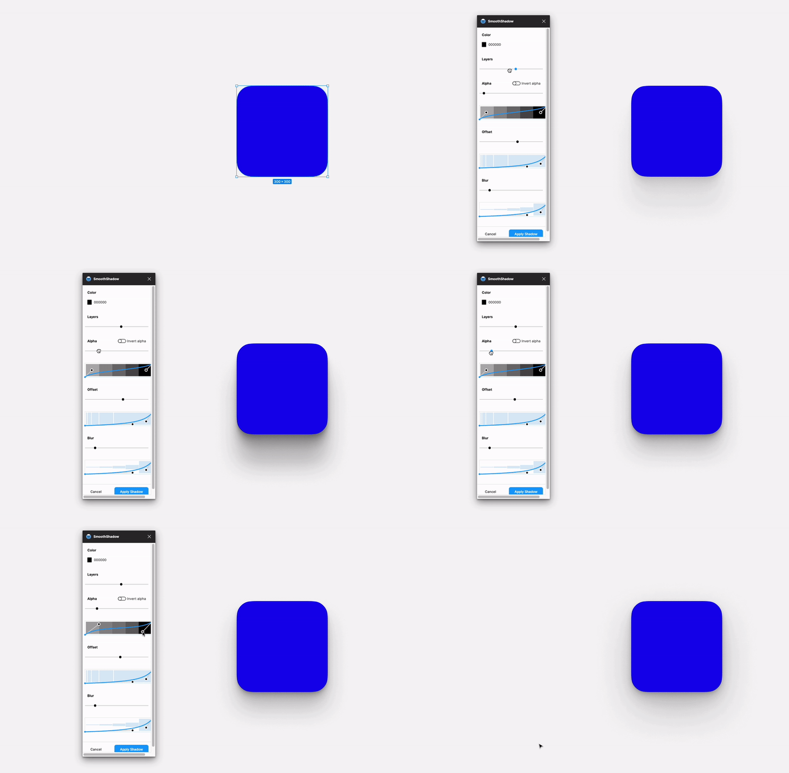
ELEVATION![]()
Tokenizing shadows adds depth and dimension to the design, creating a cohesive visual style.
This approach standardizes shadow effects, making it easier to apply and adjust them consistently across various components and interfaces.
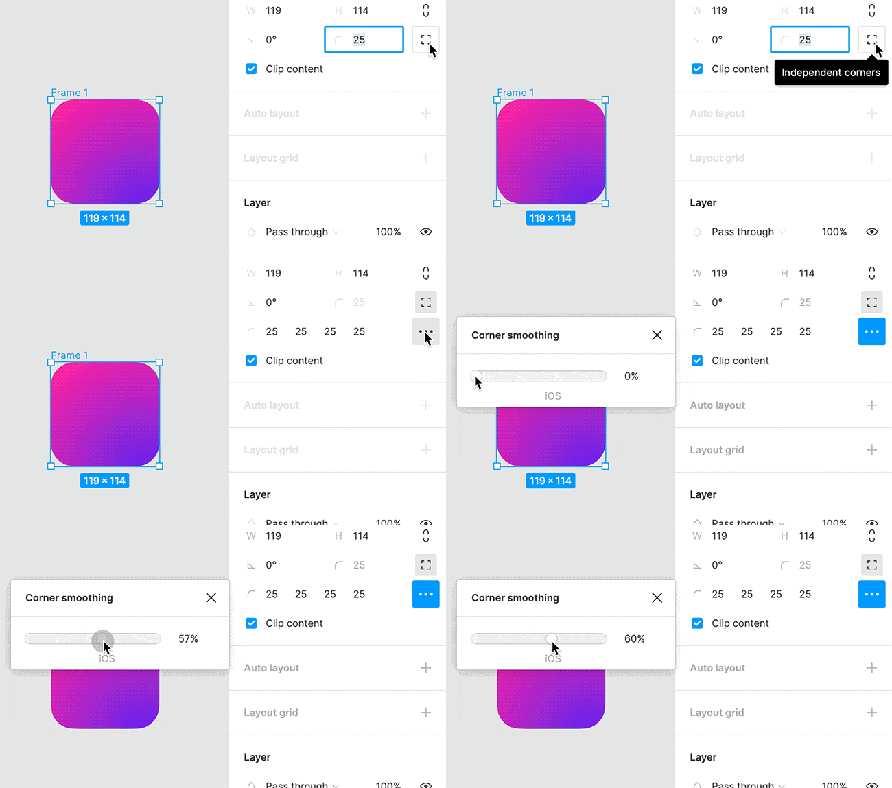
BORDERS![]()
Defining uniform border styles enhances visual cohesion and aesthetics, ensuring that all elements have a consistent look.
Tokenized borders simplify the application and modification of border properties, maintaining a polished and professional appearance.
Z-INDEX![]()
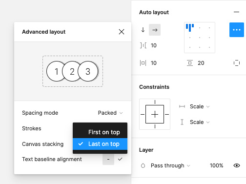
Z-index tokens control the layering of elements, ensuring a clear and organized visual hierarchy.
This standardization helps manage the stacking order of components, preventing overlap issues and maintaining a clean and accessible interface.
ASPECT RATIO![]()
Maintaining consistent aspect ratios ensures that elements fit and scale correctly across different devices and screen sizes.
Tokenizing aspect ratios simplifies responsive design, ensuring visual integrity and proper layout adaptation.

MOTION![]()
Tokenizing animations standardizes transitions and effects, enhancing the user experience with consistent and smooth interactions.
This approach ensures that motion elements are applied uniformly, creating a cohesive and engaging visual flow.

ICONOGRAPHY![]()
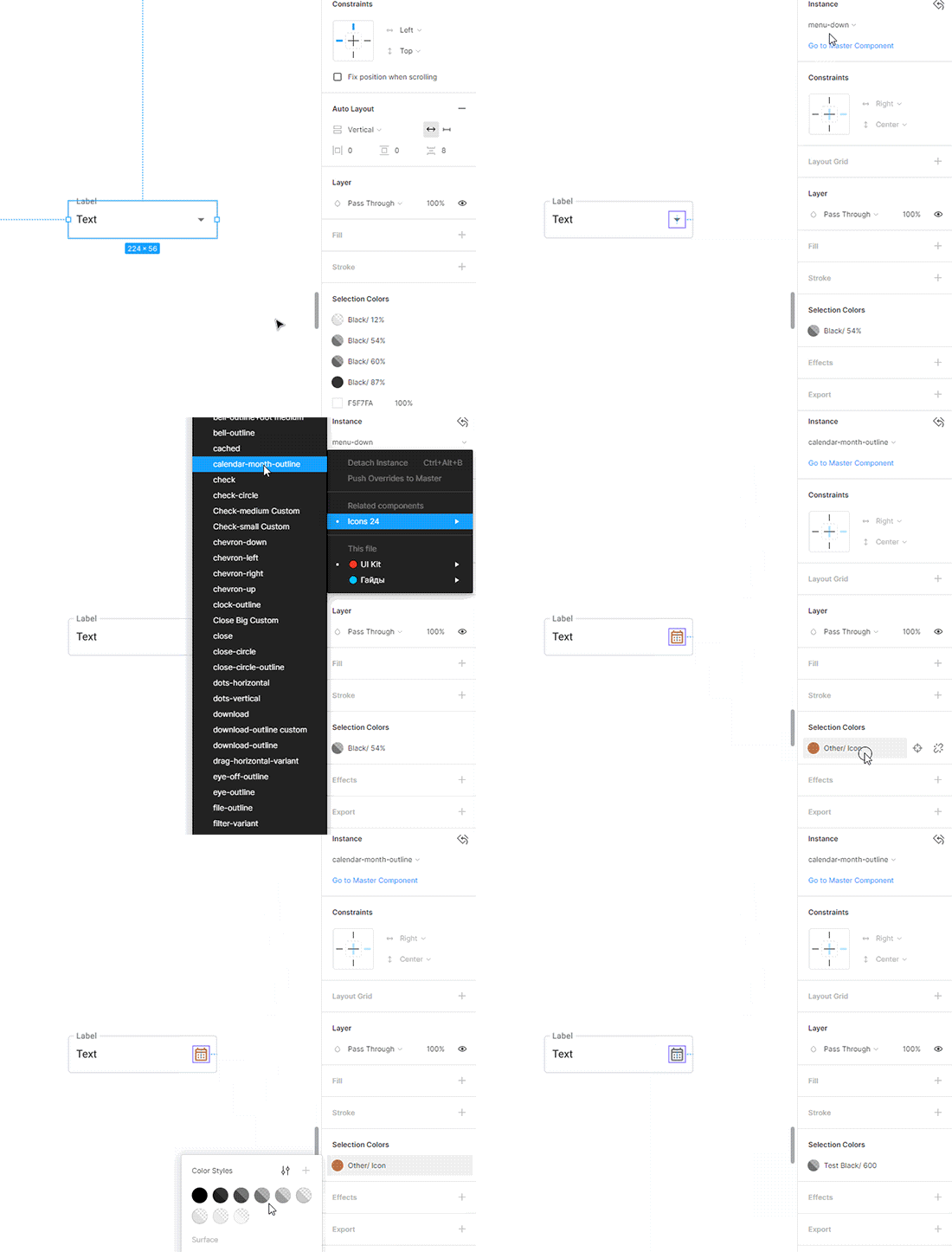
Tokenizing icons ensures a consistent style and usage across the design system, making it easier to manage and update icons.
This standardization helps maintain a cohesive visual language, enhancing user recognition and interaction with visual elements.
ACCESSIBILITY![]()
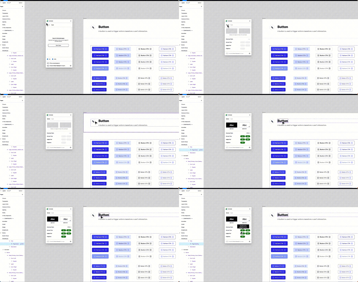
Incorporating accessibility tokens ensures the design is inclusive, meeting accessibility standards and providing a usable experience for all users.
This standardization simplifies the implementation of accessibility features, promoting a more inclusive digital environment.
STRUCTURE
Creating the style and component libraries

ORGANIZING OUR PROJECTS
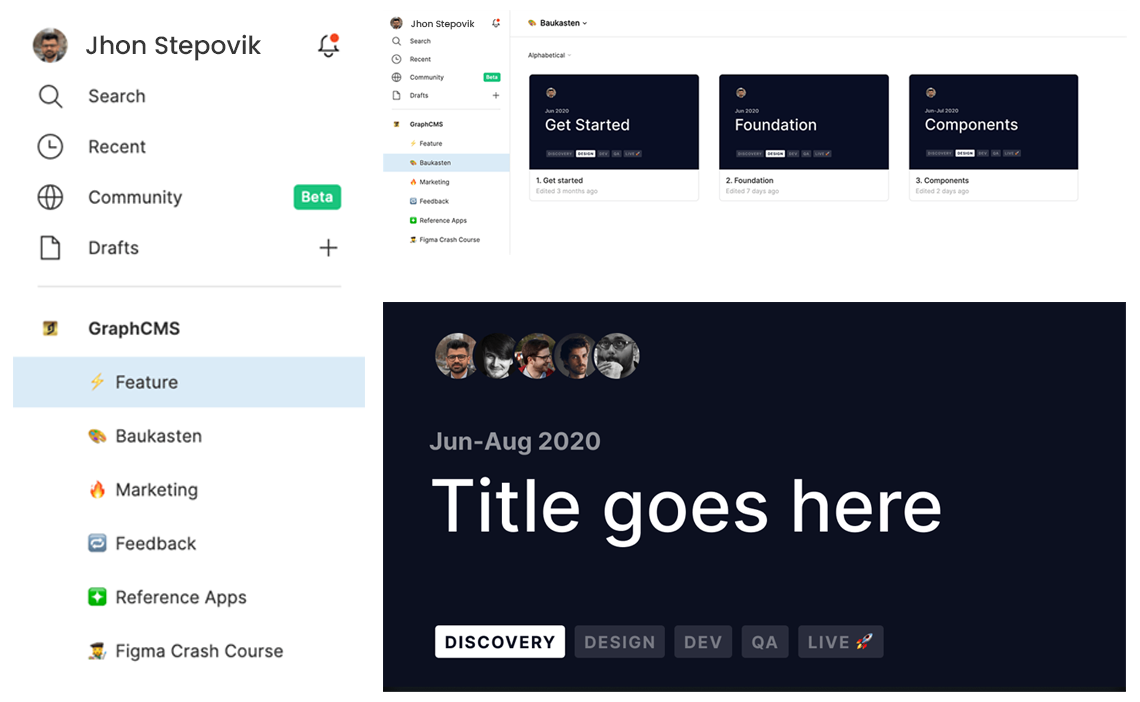
We started by organizing our libraries of brand Fundations, then we continue to organize the rest of web experiences, apps or external, categorizing and giving relevant information at first view; allowing the content to evolve and be controlled from control points.
The key is a good organization and its evolution with the help of the other stakeholders involved in our product.
COMBINING VARIANTS
Grouping and organizing similar components into one simplifies
the library and improves design efficiency.
By creating variants, we ensure consistency and ease of use, which
streamlines workflow and reduces redundancy.
In addition, this organization allows for greater system scalability, ensuring that project growth maintains quality and visual consistency.
SCREEN FLOWS
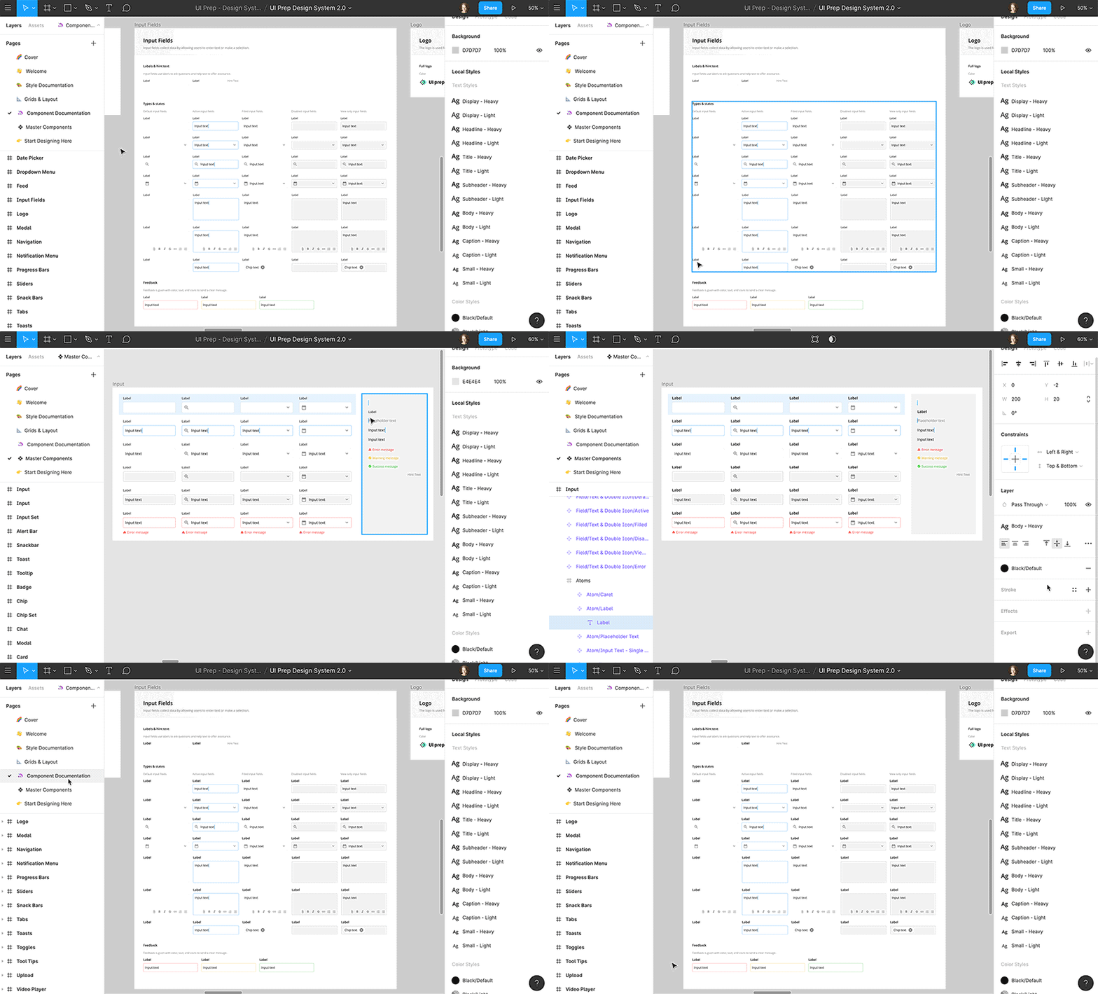
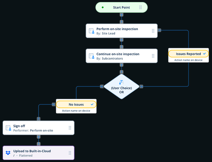
We connect designed experiences through screen flows, building patterns and alignments that create more value for users.
Screen flows are crucial because they connect different parts of a digital experience, guiding users smoothly through their journey.
By aligning and structuring these flows, we create a more intuitive and valuable experience, making it easier for users to achieve their goals efficiently.
Documentation
🚄 WE ORGANIZE STYLES AND COMPONENTS TO ALIGN TEAMS AND SHARE BEST PRACTICES
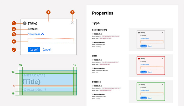
We provide detailed guidance on the use, implementation, accessibility, styles, and patterns to be followed in creating user experiences.
This ensures that every aspect of the design is clear and consistent, helping teams build accessible and cohesive digital products.
You can create this documentation directly in Figma if needed, but we recommend using dedicated tools like Zeroheight, Notion, or Supernova for a more robust experience.
📜 RULES OF USE
🦽 ACCESSIBILITY DOCUMENTATION

Implement
👩💻 STANDARDIZING DEVELOPMENT WITH CLEAR GUIDELINES AND CODE PATTERNS
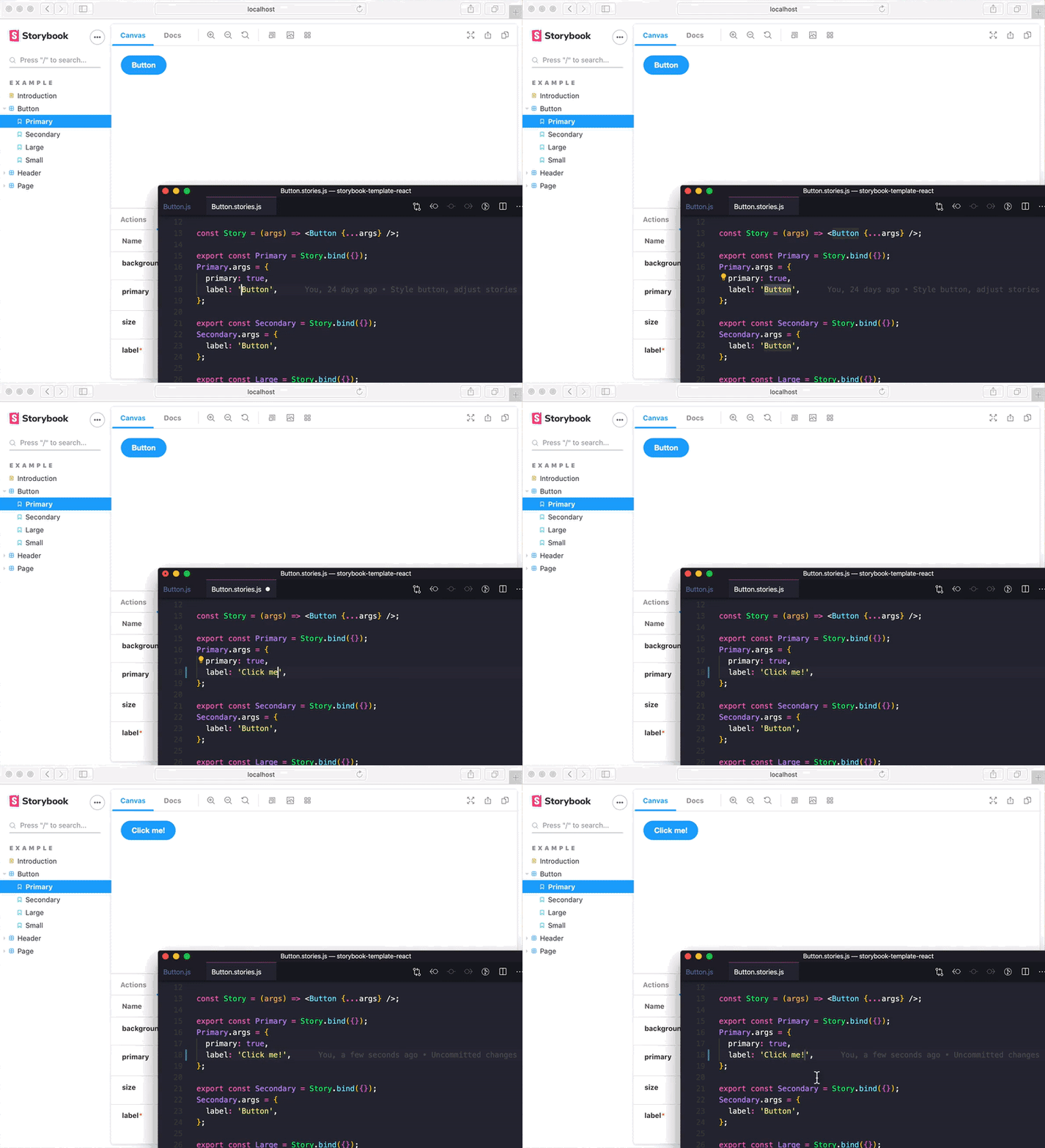
These guidelines help avoid the need for refactoring disorganized code, allowing teams to focus on new features and improvements.
⚙️ FRONTEND & BACKEND
Adhering to front-end best practices ensures consistent user interfaces while seamlessly integrating with scalable back-end services.
Aligning front-end with back-end development streamlines workflows, reduces integration issues, and supports scalable, maintainable applications, allowing teams to innovate more effectively.
Following front-end best practices ensures a consistent user experience and reinforces brand identity across platforms.
This consistency simplifies navigation and enhances user trust.
🧐 CONCLUSION
Building this design system was all about creating a solid foundation that makes design and development easier for everyone involved ![]() .
.
By establishing clear guidelines and consistent patterns, we’ve set up a framework that not only streamlines workflows but also ensures a cohesive user experience across all products.
It's a tool that helps teams work faster and more efficiently, with fewer mistakes and more focus on what really matters and delivering great experiences to users.
📈 BENEFITS & KEY LEARNINGS
- Uniform design and code practices made teamwork smoother, though following these rules sometimes limited creativity
- A Design System improved teamwork between design and development
- Using established patterns sped up development and cut down on repetitive work, though setting it all up took significant time and resources
- The system provided a strong design foundation, but it sometimes made it harder to change styles quickly without breaking consistency
- Clear guidelines helped keep everyone on track, but ensuring consistent use across teams was challenging
Creating and maintaining a design system streamlines workflows and ensures consistent, high-quality user experiences across all products


